
Working as Creative Director at No Divide, I had the opportunity to lead the design of everything we do.
My first task was to come up with a logo and branding that really represented No Divide.
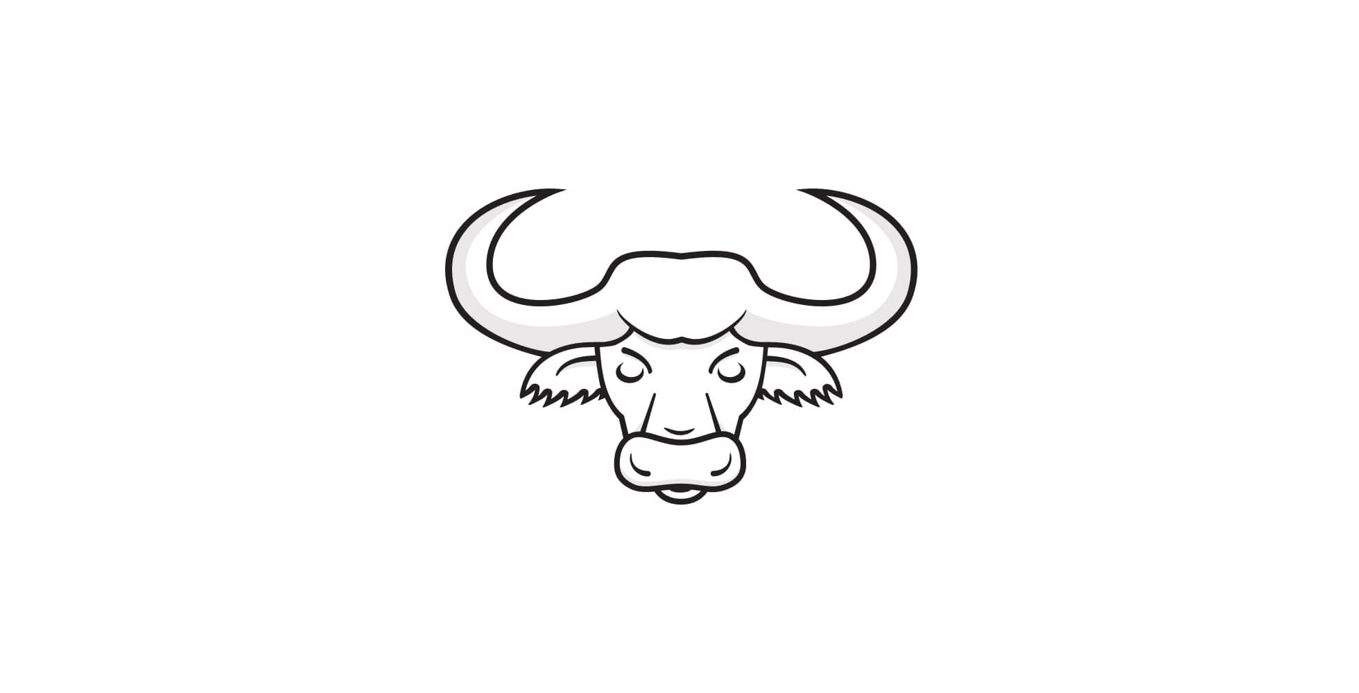
We founded No Divide on the idea that 'United we stand, divided we fall", which comes from the fable of the lion and the oxen. Straight away I had the idea of using an oxen as our logo, but I experimented with a few logotype ideas, too.

However, we really fell in love with the oxen. It just felt right. I worked on refining the logo further, and adding depth with subtle shadowing.


I designed a colour palette that is friendly and soft, our personality is friendly and approachable and I wanted our colour palette to reflect this.

As part of our latest site design I wanted to create a set of graphics that could be used to represent the 4 steps to our process. I kept them simple in their design, using subtle gradients and shadows to add the depth we wanted.


With our site design we wanted to be clear in communicating to our ideal client, we focussed on them and how we can help them with their problem.
Once we'd established our messaging, I worked with the team to create a site that we felt showed our personality. We did this by using our colour palette and enhancing it with gradients and clear, strong typography. The site was brought to life with a light use of transitions and shadows that gives the feeling of movement without be in-accessible or relying on any third party plugins.
 Back to all work