

In November 2013, I gave a talk to his local college and started compiling a list of a few of the books, apps and websites that I had saved in my bookmarks as I thought it would be a great resource guide for the students. The best decision I made was to write the list on Medium and make it public. The post was named “Resources” and at the time had just over 80 items.
As time went on the list grew and grew, and GREW!
At the time of writing Resources has had over 190,000 visits and over 1,800 recommendations. It was clear to me that this was something that people valued and wanted to be a part of, and more importantly contribute to.

I began to prototype ideas for a web app, a directory of resources where people could submit their favourite resources and create their own feed based on their interests. I partnered with developer Ryan Taylor in May and 3 weeks later the beta of oozled was launched, on launch we got great media coverage and were #3 Product of the Day on Product Hunt.

The site has grown and been through a few iterations and improvements, including the addition of search, filtering and an improved UI.
One of our first iterations was a navigation overhaul, moving away from a single hamburger menu to bring items such as Submit, Login/My Stuff and Search into the main heading and a single 'browse' menu for all categories.

I re-aligned the category pages so that they are cleaner and easier to digest. When we initially launched we had a card-flipping UI, which was overkill. Instead I re-designed the individual items to give all the info a user needed in clear view. The aim was to make browsing the site faster and easier to digest.

We grew very quickly to over 6,000 users, which naturally meant we needed more time to spend on the platform. To do this we opened the doors to paid partnerships, this allowed us to continue working on oozled while pursuing client work.
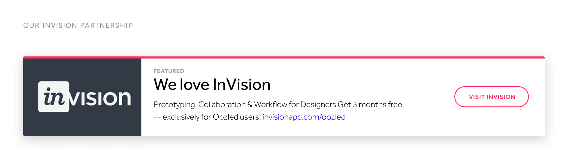
One of our first partners was InVision (thanks guys)! We paused all our partnerships when we had to take a break from maintaining oozled, but would very much like to create version 2 in the future.
Along the way we regularly shared our changes via our blog on Medium and released videos such as the one below to highlight the changes we made.
I chose a vibrant, bold colour palette for oozled. At launch this was like Marmite, loved or hated. We embraced our electric blue, and as trends changed we got more and more love for our colour palette. So I'd like to think it was the right choice in the end ;)

 Back to all work